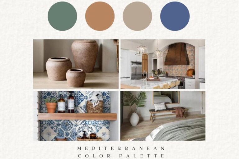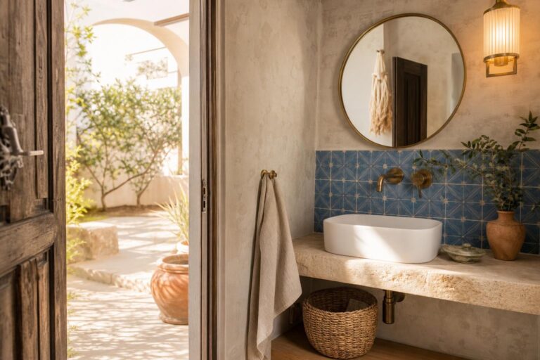
Mediterranean Color Palette Ideas for Warm Minimal Rooms Without White Walls
A room can feel Mediterranean without a single bright white wall. In fact, many of the most believable homes in Provence are not white at all. They are chalk, sand, flax, limestone, clay, smoke, olive leaf, and aged wood. The colors are quiet, but they have body. They look better in imperfect plaster than on glossy board. They shift with the weather. They accept shadow.
The challenge is that a warm minimal room can easily go too beige, too yellow, or too themed. Add one terracotta cushion, one black lantern, and one bouclé chair, and the room may still feel strangely generic. The difference is not a single “Mediterranean” color. It is the relationship between undertones, textures, and the way daylight moves across matte surfaces.
Let the Walls Be Warm, Not Bright
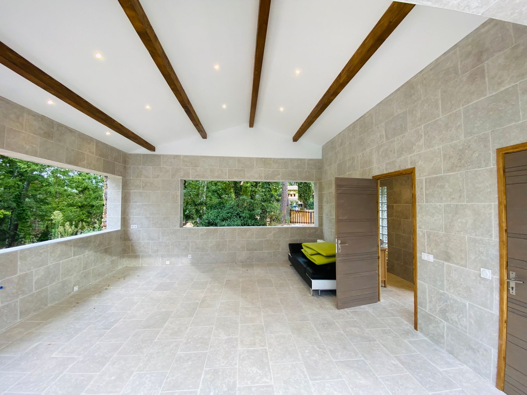
If you are avoiding white walls, begin with a wall color that behaves like a material rather than a backdrop. In an old village house, the wall might be limewashed plaster over stone. In a newer apartment, it may be painted drywall. Either way, the goal is a soft mineral ground: not cream in the sweet, yellow sense, and not gray in the cold, urban sense.
Look for wall tones that sit between chalk, dry sand, pale limestone, and unbleached linen. These shades are often more forgiving than pure white because they reduce glare and make natural wood, iron, and ceramics feel settled. In a bright south-facing room, a slightly cooler limestone beige can keep the space from turning golden. In a shaded room, a flax or oat tone will usually feel warmer without becoming buttery.
Finish matters as much as color. A matte finish softens the room and hides the hard edge between wall and trim. Limewash, mineral paint, or a flat washable paint can all work, depending on the room and your tolerance for patina. Limewash has movement and depth, but it can mark and vary from wall to wall. Flat paint is simpler to maintain, but it needs careful sampling because it will not have the same cloudy variation.
Paint sample boards rather than tiny squares directly on the wall. Move them beside the window, behind the sofa, near the floor, and under evening lamps. A wall color that looks beautifully muted at noon can turn peach after sunset if the lamps are too amber or the flooring has a strong orange cast.
Build the Room Around Stone, Clay, and Flax
A no-white Mediterranean palette becomes convincing when the color comes from materials first. Instead of choosing five paint colors and trying to match objects to them, start with the surfaces that would naturally belong in a Provençal home: limestone, terracotta, aged oak, walnut, plaster, linen, cane, and blackened iron.
Terracotta is the obvious warm note, but it should be used with restraint indoors. In small rooms, a full terracotta wall can feel heavy unless the light is excellent. It is often more graceful as a lamp base, vessel, tile, small stool, or the muted red-brown in a woven textile. Choose terracotta that looks dusty or sun-faded rather than bright orange. The more saturated the clay, the less of it you need.
Limestone and travertine bring the palette back to calm. Their beige, ivory, gray, and fossil-like markings prevent warm rooms from feeling flat. A travertine-topped side table, a stone tray, a pale mantel, or even a small lamp base can act as the bridge between clay and linen. If your flooring is already warm wood or terracotta tile, stone accents are especially useful because they cool the palette without making it look gray.
Flax and natural linen should not match the walls exactly. A room becomes more alive when the linen is a half-step lighter, darker, or rougher than the plaster. For curtains, unlined or lightly lined natural linen gives the softness associated with the South of France, but it is not the right choice for every window. In a bedroom where darkness matters, use a linen face fabric with a more functional lining. In a living room, let the weave show.
The Five-Hue Decision Framework for a No-White Mediterranean Palette
Use this framework before buying paint, upholstery, or large rugs. It keeps the palette warm and minimal without letting every piece collapse into the same beige note.
- Ground tone: Choose one wall or large-surface color in chalk, limestone, sand, oat, or flax. This should be quiet enough to cover most of the room without demanding attention.
- Anchor tone: Add one deeper natural shade, such as aged oak, walnut, tobacco, muted bronze, or blackened iron. This gives the room structure and prevents the pale colors from floating.
- Clay tone: Use terracotta, rust, or pinkish plaster sparingly. Treat it as warmth, not as a theme.
- Green-gray tone: Bring in muted olive, sage, dried rosemary, or eucalyptus. This is especially useful when the room has a lot of beige upholstery or pale stone.
- Soft shadow tone: Include one gentle gray-brown, smoke, mushroom, or taupe. It helps the room feel lived-in and keeps the palette from becoming too clean.
The most common mistake is skipping the shadow tone. Without it, warm minimal rooms can look unfinished, especially in winter or under artificial light. A mushroom lampshade, taupe linen cushion, smoked oak frame, or gray-beige ceramic piece can do more for the room than another cream textile.
How to Place Color So It Feels Architectural
Mediterranean color works best when it appears to belong to the room, not sit on top of it. In older Provençal interiors, color often gathers around thresholds, shutters, floors, beams, niches, and ceramics. You can borrow that logic even in a plain modern room.
Keep the largest vertical surfaces quiet. Walls, curtains, and large sofas should usually stay within one or two close earth tones. Then place stronger colors lower in the room or in objects with real material presence: a terracotta vessel near the floor, a walnut coffee table, an olive linen cushion on a pale sofa, a dark iron reading lamp beside a plaster wall.
Color also needs breathing room. If every accessory is clay, ochre, or olive, the room starts to feel decorated rather than inhabited. Leave some surfaces plain. A simple wooden table with one ceramic bowl is often more convincing than a crowded arrangement of vases, books, and candles. The restraint is what makes the warmer tones feel intentional.
For trim, avoid automatic bright white. In many rooms, trim painted the same color as the wall, or only slightly lighter, looks calmer and more architectural. If you have old timber beams, stone windowsills, or handmade tile, low-contrast trim lets those materials lead. If the room lacks architectural character, a slightly deeper trim in greige, mushroom, or muted olive can add definition without feeling decorative.
Lighting Changes the Palette More Than Paint Chips
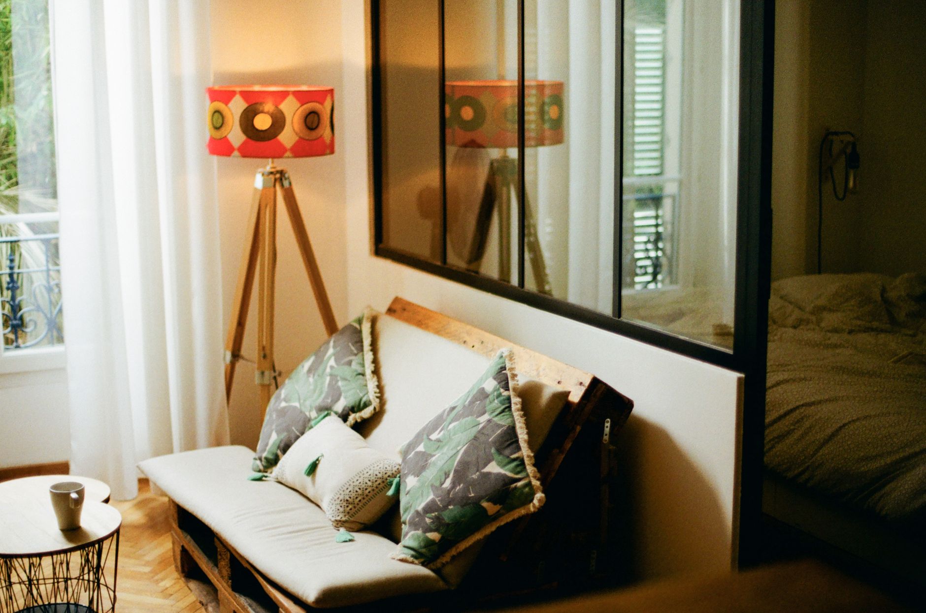
A warm Mediterranean palette depends on shadow. This does not mean the room should be dim; it means the light should come from several modest sources rather than one harsh overhead fixture. Matte plaster, linen, terracotta, and travertine all look better when light grazes them from the side.
Use floor lamps and table lamps to create low pools of light in the evening. A linen shade softens the bulb and keeps warm wall colors from turning too orange. A ceramic, terracotta, wood, or stone lamp base can also reinforce the palette without adding another loose decorative object.
Pay attention to bulb temperature, but do not rely on warmth alone. Very amber bulbs can make sand walls look yellow and terracotta look overly red. A soft warm bulb is usually enough. If the room has several lamps, keep them in the same general warmth so one corner does not look peach and another looks gray.
Shadows are useful around textured materials. A lamp beside a limewashed wall will reveal irregular movement. A low light near a rough ceramic vase makes the object feel handmade. A floor lamp near linen curtains gives the fabric weight after sunset. These small lighting decisions are what keep a minimal palette from feeling like a paint showroom.
Keeping Soft Colors From Looking Flat
When a room uses chalk, sand, flax, and stone, texture has to do the work that pattern or contrast might do elsewhere. The palette should be quiet, but the surfaces should not all be smooth. Combine tight weaves with slubs, matte ceramics with aged wood, pale stone with darker iron, and soft linen with something more structured, such as cane or wicker.
If the room feels too pale, do not immediately add a bold color. First ask whether it has enough weight. A dark wood chair, blackened iron lamp, rubbed bronze hardware, or smoked oak frame may solve the problem more elegantly than a bright cushion. Warm minimal rooms often need depth, not more color.
If the room feels too brown, add mineral notes. Travertine, limestone, chalky plaster, pale ceramic, or a muted green-gray textile can cool the palette without breaking its warmth. Plants can help, but choose restrained greenery rather than a jungle effect. Olive branches, rosemary, bay, myrtle, or a single sculptural indoor tree feel closer to a Southern French sensibility than a crowded collection of tropical leaves.
Maintenance should shape your choices. Pale linen upholstery is beautiful, but it may not suit a dining bench or a family room sofa unless the covers are removable or the fabric is forgiving. Terracotta can stain if unsealed. Matte painted walls can scuff in narrow halls. If you love these materials, use them where they can age gracefully: linen curtains instead of a high-use ottoman, terracotta vessels instead of porous kitchen counters, limewash in a bedroom rather than a busy mudroom.
Room-by-Room Adjustments for the Same Palette
Living room
Let the walls and sofa stay close in value, then add depth through wood, lamps, and one clay accent. A sand wall with a flax sofa can look elegant when grounded by a walnut table and a ceramic lamp. If the room has a television, avoid surrounding it with pale emptiness; a darker wood console or muted taupe wall behind it will make the screen less abrupt.
Bedroom
Bedrooms can handle a softer, more enveloping palette. Oat walls, natural linen bedding, aged wood nightstands, and a single terracotta or ceramic lamp are enough. Keep olive or rust accents low and muted. The bed should feel restful, not styled for a market stall. If the ceiling is low, paint it the same color as the walls or a diluted version rather than using bright white.
Dining room
Dining rooms benefit from slightly more contrast because they are often used in evening light. Pair limestone or flax walls with blackened iron, wood, brass, or a deeper ceramic tone. Table linens can introduce texture without committing the whole room to a color. A muted runner, handmade-looking plates, and warm lamp or pendant light will usually feel more timeless than a heavy themed centerpiece.
Bathroom
In a bathroom, warm color must work with hard surfaces. If the tile is cool gray, choose a wall color with a mineral beige undertone rather than a yellow cream. If the room already has travertine or warm stone, keep towels in linen, chalk, or mushroom rather than adding saturated blue. Brass or aged metal can warm the space, but keep the finish soft rather than shiny.
Shop the Look
These pieces are best used as small material notes within a larger palette: clay for warmth, linen for softness, stone for calm, and ceramic for handmade texture.
- terracotta table lamps
- linen shade floor lamps
- travertine table lamp
- ceramic table lamps
- brass table lamps
The Quiet Test Before You Commit
Before you finish a no-white Mediterranean palette, remove one strong accent and one decorative object from the room. If the space suddenly looks calmer and more architectural, the palette was already doing enough. If it looks empty, add depth through material rather than brightness: wood, stone, iron, linen, or clay.
The most enduring Mediterranean rooms are not built from a list of colors alone. They are built from surfaces that accept age, textiles that soften the light, and objects that look useful as well as beautiful. Keep the palette warm, matte, and slightly imperfect, and the room will feel closer to Provence than to a trend board.
Affiliate disclosure: La Maison du Sud may earn a commission from qualifying purchases made through links in this article, at no extra cost to you.